Table of contents:
- The basics
- Creation process and variety
- General rules for creating infographics
- Important stats to keep in mind
- Tools to build and promote your awesome infographics
In this day and age, any business expert and infographic designer will point in the direction of visual content as being the best approach to get noticed.
With 65% of businesses allocating at least 10% of their capital to visual content and visuals like charts, graphics and images being known to increase readership by over 80%, it makes sense that you’d want to learn as much as possible about creative infographic design.
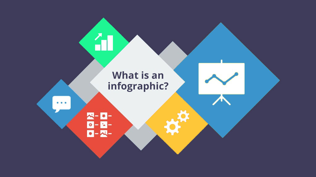
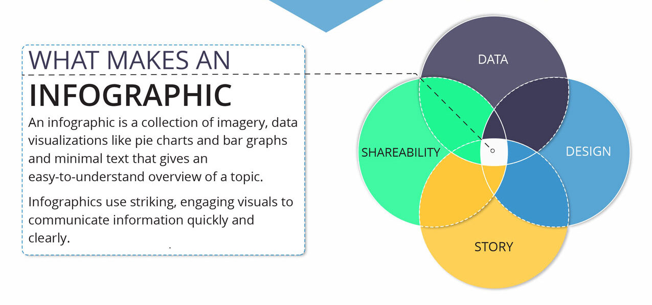
An infographic can simply be defined as a form of content that acts as a visual representation of data. Usually containing a collection of minimal text, imagery and various data visualization elements, digital infographics provide an easy means of viewing, defining or understanding complex topics.
It is also a great tool for visual communication as well as for online marketing and promotion.
The basics
You don’t need to own an infographic design agency to know how useful and multifaceted a quality infographic can be.
The power of a good infographic stands in the ability to deliver information across multiple dimensions – both visually and through writing – which makes them shareable and often capable of going viral due to the way they can draw attention from readers.
Through minimal text, catchy graphics and designs, practical data visualization elements such as maps, graphs and pie charts, and differences in contrast, font size or color depicting data of varying importance, a digital infographic can quickly convey the right information in the correct order.
Because of that, infographics can be used for fast engagement and as a way to bring relevant information to your readership and following.
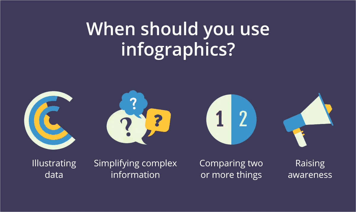
Complex topics such as the impact of market changes on demand, or the understanding of a complicated mathematical model, can be easily explained visually through an infographic that was prepared correctly.
Data correlation between information on spending and the benefits of opting for certain investment opportunities can also be presented more quickly and easier to understand, so you can impress rather than bore your business partners.
You might also want to use creative infographic design:
- as a catchy addition to blogs,
- to make your social media posts more fun and shareable,
- to boost traffic and SEO,
- to eliminate the confusion of your readers when it comes to understanding your vision,
- to gain relevant insight on researched data
- and building an accurate picture of why taking action might be needed for specific problem solving.
Creation process and variety
A digital infographic can take shape in a number of ways. The most straightforward approach, however, is to go from inspiration to research, creation and publication.
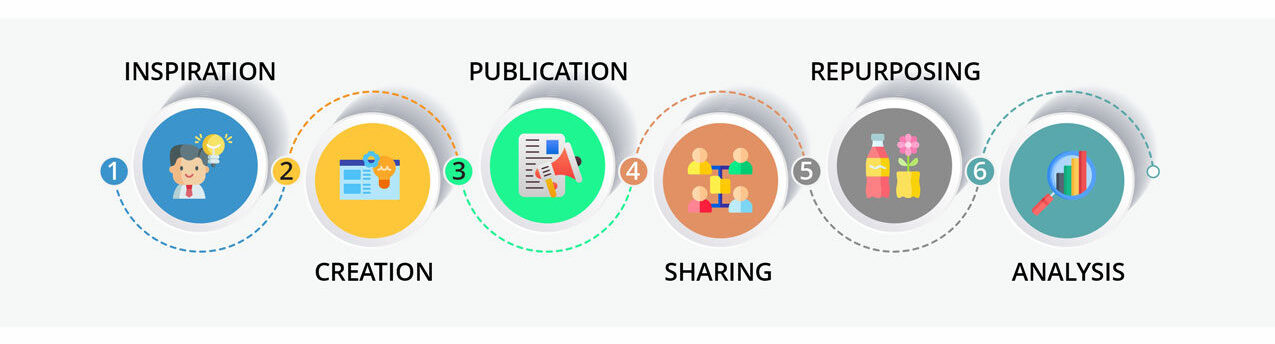
An infographic’s life cycle
Sometimes, infographics are additionally repurposed and shared in new ways – such as when some of the data can be introduced in a new article, so you might take it and use it for a smaller chunk of content, or to populate a new infographic that will tackle a more specific area of the topic that the larger one had addressed.
…same as we repurposed this infographic for composing the article you are now reading 😊
Of course, everything starts with an idea 💡
During the inspiration stage, the concept of the infographic takes shape, and based on it you can decide what type of infographic you will use to convey the data you find.
The research stage will also be instrumental in determining that approach, since you can’t always know in advance what type of data will support your idea or cause. You could be looking more at detailed statistics that would require adding a lot of charts and graphs, or the complex data you find might require the use of a Data Viz infographic.
Visual articles are also among the most common means of transposing writing into infographic form.
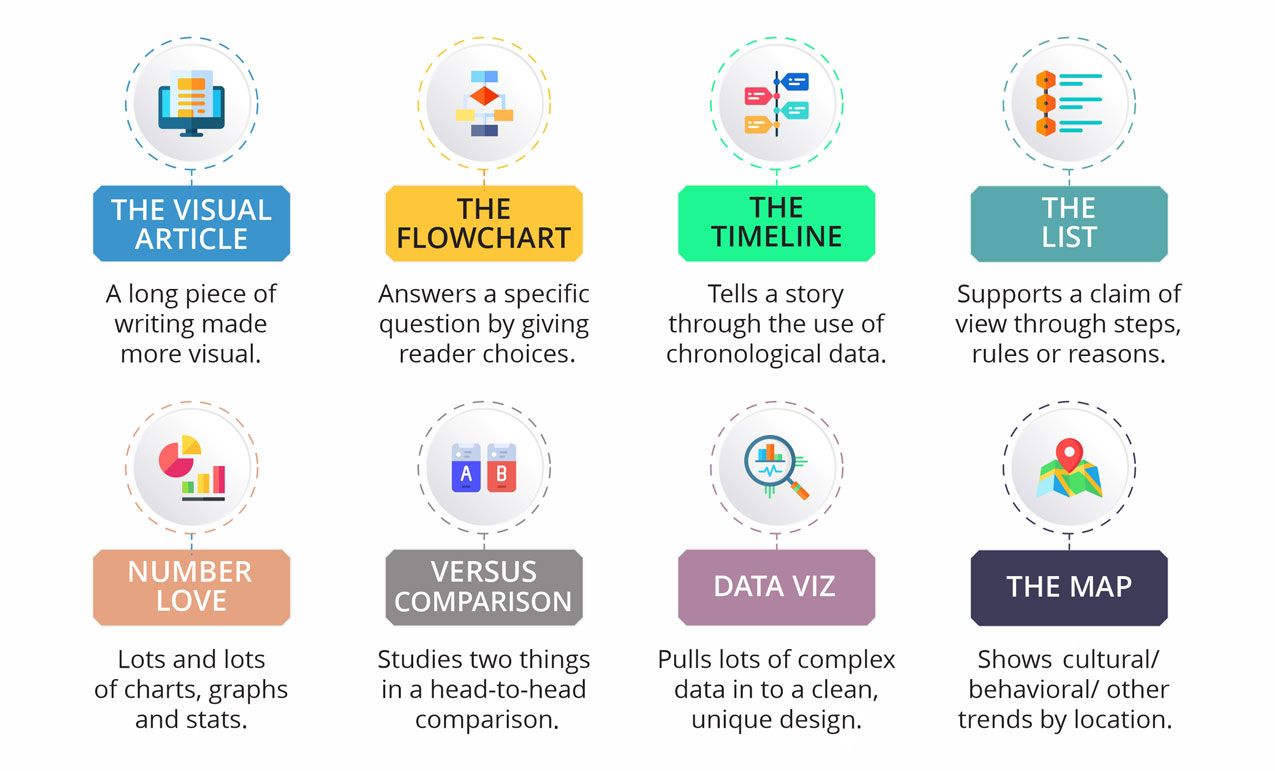
8 common types of infographics
Other types to consider also include flowcharts used to aim for a specific answer, the timeline infographic – which is essentially a story told through chronological data – a list with steps and rules supporting a claim, or a versus comparison between two things or claims.
If you want to showcase cultural or behavioral trends by location, you can also use map-like infographics that can really put geographic data into proper perspective.
General rules for creating infographics
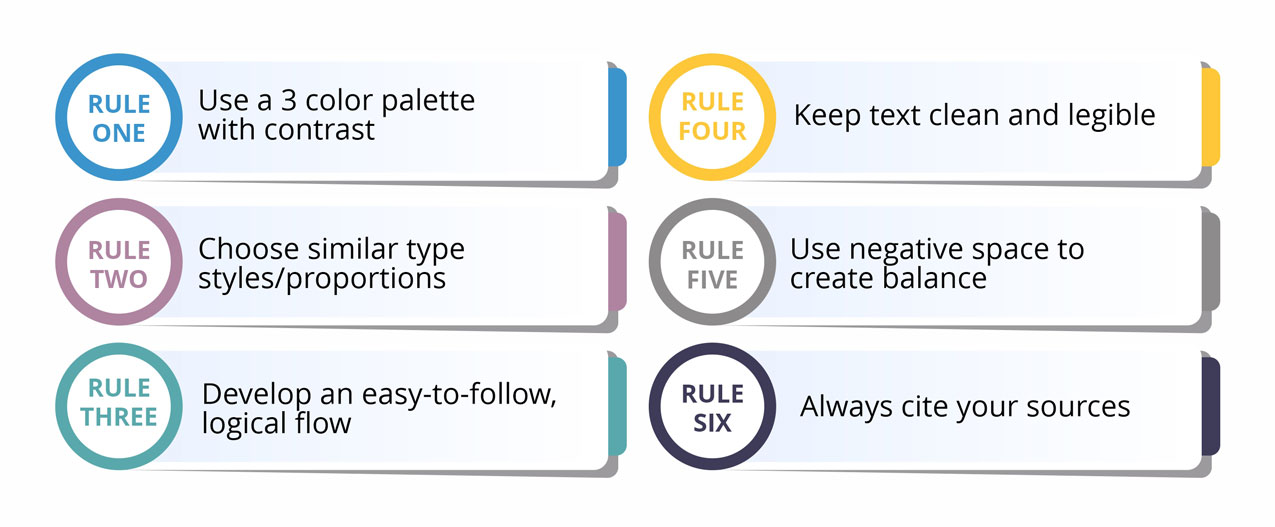
Whether you’re building a simple social media infographic, or you have one that focuses on highly complex data, knowing how to create an infographic also depends on certain, very specific rules. These rules will help you ensure that you have the best visual approach and structure to ensure easy reading and maximum information retention:
- A 3-color palette with high contrast: keeping the color palette is essential to avoid overwhelming your readers, while the contrast has to be used to highlight specific elements of your infographic for ideal visual delivery.
- Use similar styles and proportions throughout your infographic for consistency. This is especially important for achieving a professional appearance in a business infographic.
- Ensure easy logical flow, so that readers will not be confused or feel like they need a 200 IQ just to figure out half of what you’re trying to say.
- Keep text easy to read and free of grammatical errors. That way you’ll avoid turning away viewers who are easily triggered by inconsistencies.
- Balance it out with negative space: you’ll find that the space between your text and graphical elements is just as important, if not more so, than the actual information you’re trying to convey.
- Always make sure to cite all your sources. You don’t want to run into unwanted issues having to do with plagiarism, liability and copyright claims.
Summing up the basic rules
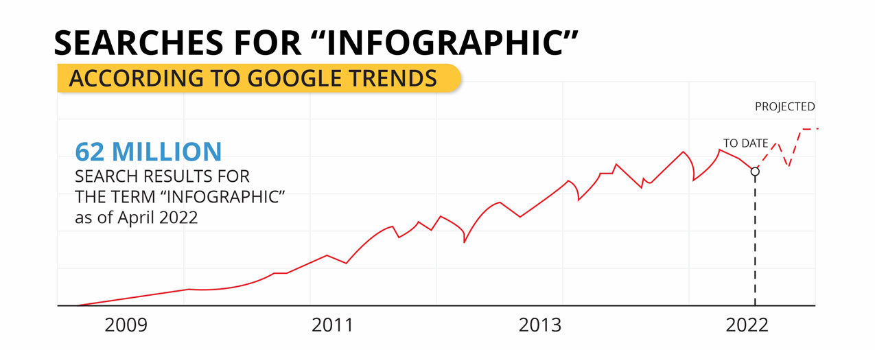
Important stats to keep in mind
Did you know that in the medical field, patients viewing an infographic about their treatment are 1.24 times more likely to retain the information? When you learn more about these kinds of stats, you will be far more motivated to learn how to make a good infographic.
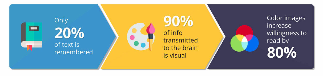
First, when comparing infographics with text read silently or out loud, it’s important to note that only 20% of text is remembered, while 90% of the information readers are likely to retain is visual in nature.
Moreover, the presence of color images increase readability by more than 80%, and people who follow directions that are depicted using both text and images will have a 323% greater chance to do better compared to people who follow instructions that have no illustrations.
Saving time and avoiding that pesky feeling of being overwhelmed in today’s busy and fast-paced online world is also something that infographics can greatly help with. Studies indicate that about 39% less time is spent finding relevant information in a document containing graphics and visualization elements.
When color is used properly, that number can almost be doubled. Also, organizations that use data visualization on a regular basis are almost 30% more likely to find the data they need when they need it.
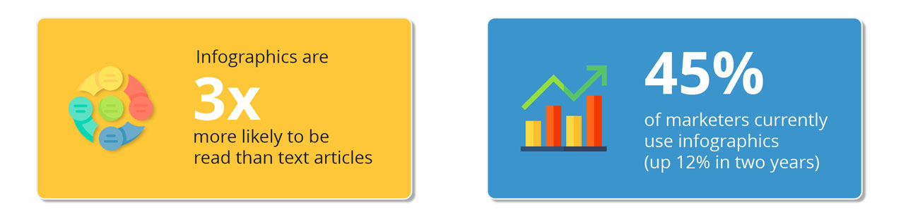
When it comes to marketing, knowing how to make an infographic that is visually appealing will greatly pay off. Infographics are three times more likely to be read than regular articles, and more than 40% of content creators claim that most of the engagement in their marketing efforts is driven by unique visuals.
About 45% of marketers currently use infographics regularly, and that number is increasing rapidly – as it has already grown by 12% in the past 2 years.
Infographics are in demand among content publishers
Tools to build and promote your awesome infographics
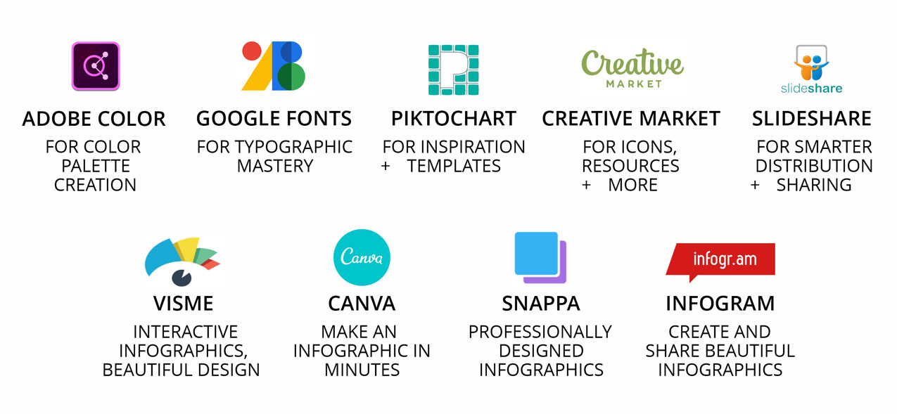
When striving to create a quality infographic, online tools and services are available to not only speed the process up, but also ensure customization and better promotional value. Templates, graphics apps and customization programs are available to ensure you can add your own unique flare to your infographic and have as many people as possible access it.
Some good examples include Piktocart for templates, Adobe Color for palette creation and Infogram – a tool for creating and sharing some of the most stunning infographics you will ever see.
Some tools, like Visme, focus more on interactivity and an appealing design. Others, like Canva and Snappa have practical features that allow you to create infographics quickly and ensure that they have a professional look and feel.
Of course, with each and every one of these tools, there is a learning curve. You could run into a lot of difficulty figuring out your infographic layout and trying to learn how to create an infographic that will truly appeal to your following. That is where services like 101content come in.
Why choose 101content?

We are a leading provider of a variety of high quality, professional forms of content for SEO promotion, internet marketing and content marketing geared towards the auto industry.
Our experts are able to not only use the best tools for crafting high quality, beautiful looking infographics, but they also know how to build them from the ground up to highlight your best points, convey your ideas clearly, showcase your data and promote your business in the process.
If you truly want to have the best infographic design out there, check out our services or talk to our friendly chat bot (situated on the bottom right of your screen). We can help you craft the most professional, relevant and overall finest digital infographic designs that you can imagine.